French country decorating guide
French Countryside Gallery Wall: A Relaxed Provence-Inspired Display
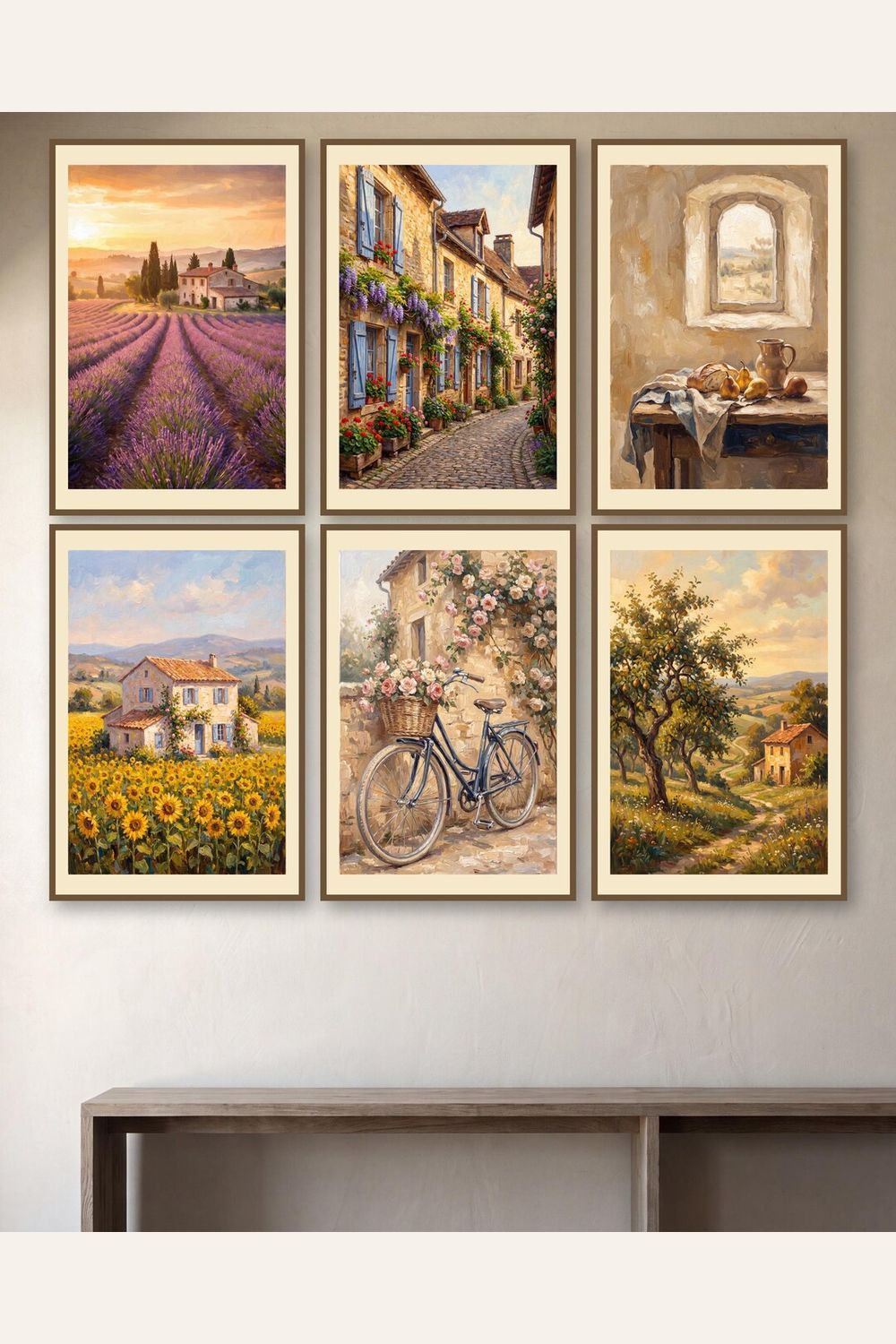
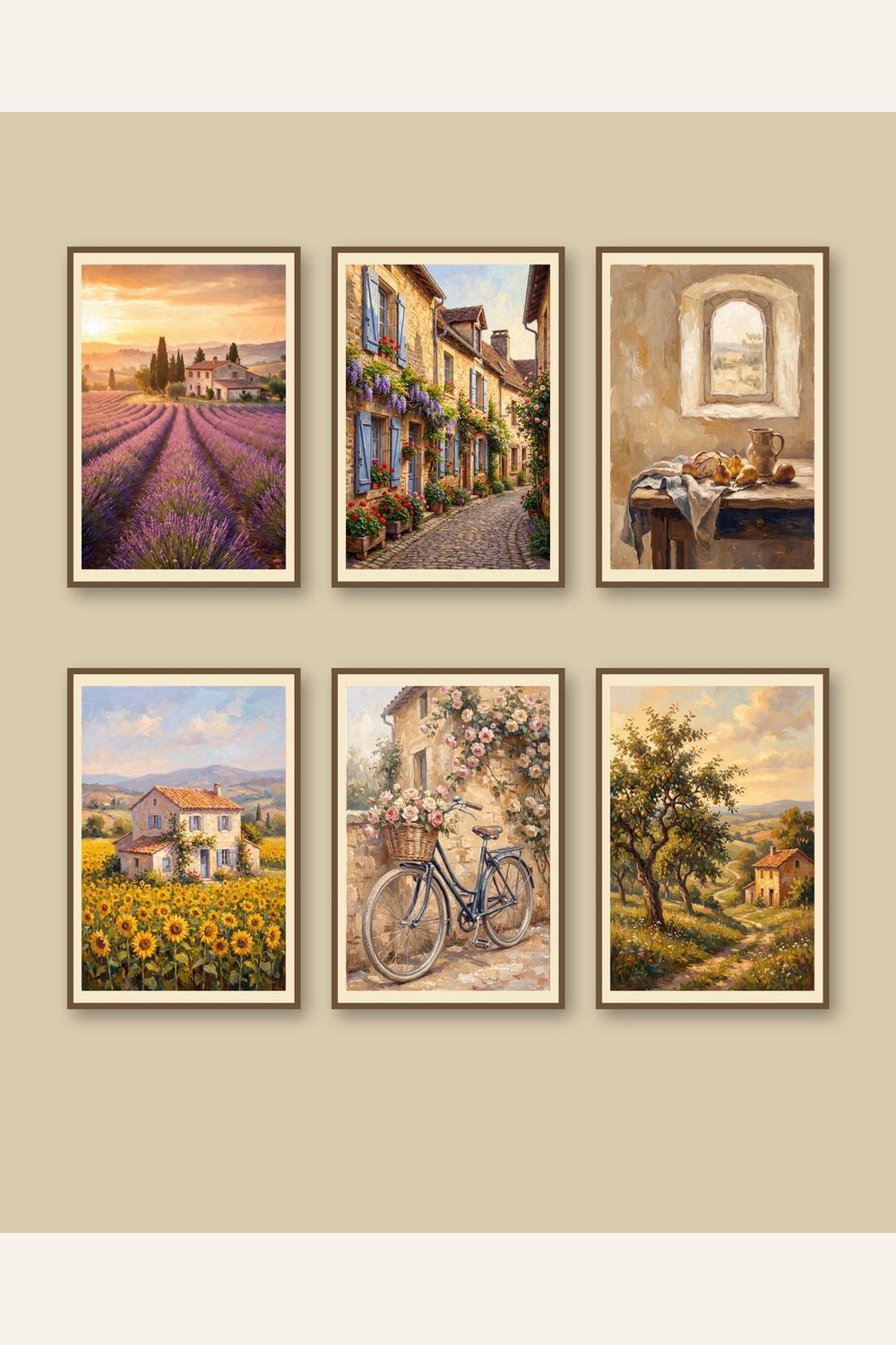
A French countryside room rarely depends on one decorative symbol. Its character comes from a measured mix of weathered materials, practical furniture, soft landscape color, and objects that feel gathered over time. A coordinated set of lavender, village, and rural prints can establish that atmosphere without turning a kitchen or dining room into a literal theme. Six related designs provide variety, while repeated frames and consistent spacing keep the wall composed.
Choose the wall by how the room is used
Begin with the room rather than a frame size. In a kitchen or breakfast nook, artwork should sit clear of steam, grease, splashes, and heat. A dining room sideboard offers a wider, calmer anchor. A guest bedroom or home office can support a more intimate grid where small landscape details reward close viewing.
- Above a sideboard: keep the complete arrangement narrower than the furniture and visually centered on it.
- In a breakfast nook: use a compact grid outside the chair path and away from repeated moisture or cooking residue.
- On an entry wall: confirm that doors, bags, coat hooks, and passing traffic cannot strike the frames.
Cut six paper templates to the outside dimensions of the intended frames, including mats. Attach them with removable painter’s tape, then inspect the arrangement from the doorway and normal seated positions. This test reveals whether the overall footprint is too small, whether furniture alignment feels accidental, or whether frame gaps that looked balanced on the floor become excessive on the wall.
Build a Provence palette without overdecorating
Lavender purple, faded blue, warm limestone, muted olive, cream, and sun-softened terracotta can suggest Provence without requiring a room full of themed accessories. Echo one or two colors in a linen, ceramic vessel, book spine, or small bunch of dried botanicals. Let the prints carry the narrative; the surrounding room should remain practical.
On warm white, pale cream, or light greige walls, natural oak and medium wood frames add definition without harsh contrast. A restrained antique-brass-tone frame can work in a traditional dining room. If the wall is deeper blue, green, or clay, use a light mat to separate the artwork from the paint. Whichever finish you choose, repeat it across all six pieces so the gallery reads as one collection.
Pick a six-print arrangement that matches the architecture
A two-by-three grid is the most adaptable layout. Keep every horizontal and vertical gap equal and align the outer edges. Distribute darker or more detailed images across the grid instead of clustering them on one side. The visual center should relate to standing eye level, but furniture matters more than a generic measurement: a gallery over a console should feel connected to the console rather than floating near the ceiling.
A single row can suit a long dining-room sideboard if all six frames fit with comfortable outer margins. Two columns of three work on a narrow wall between a doorway and cabinet. Avoid forcing a wide layout into a cramped wall; smaller frames with consistent mats generally look more intentional than large frames squeezed together.
Coordinate the display with kitchen and dining materials
French country interiors often mix wood, stone, woven fibers, and aged metal. Use the gallery wall to organize those materials rather than compete with them. If the room already includes strong patterned tile or upholstery, choose quiet frame profiles and generous mats. In a simpler room, a warmer wood finish can supply texture.
Keep fragile artwork away from a sink, cooktop, kettle station, fireplace, or direct afternoon sun. Even framed prints can be affected by repeated humidity, heat, and ultraviolet exposure. A dining-room wall, enclosed pantry entry, dry breakfast area, or adjacent hallway usually protects printed art better than a backsplash zone.
Plan printing before buying frames
Measure the actual frame opening, including the mat, and choose the supplied file prepared for that aspect ratio. Do not stretch an image to fill a mismatched opening. Inspect the print service’s crop preview around lavender stems, rooflines, village edges, and horizon details. When uncertain, print one design first to confirm scale, color, paper, and cropping before ordering the other five.
Matte or lightly textured paper complements soft countryside imagery and usually limits reflections better than a glossy finish. Use the same print service, paper, finish, and color settings for all six designs. See the printable wall-art guide for help with aspect ratios, paper selection, home printers, and local or online print services.
A coordinated French countryside option
The active French Countryside collection brings six Provence-inspired lavender, village, and rural designs into one set for a kitchen, dining room, breakfast nook, guest room, entry, or relaxed office. Consult the live Etsy listing for current availability, price, and exact included files.
View the active French Countryside print set on Etsy
Seller disclosure: This link opens JTNPrintableCo’s Etsy listing. JTNPrintableCo is the seller and may receive revenue from purchases. Etsy handles checkout and digital delivery; the live Etsy listing is the source of truth for current price, availability, and included files.
Understand digital delivery before buying
This is a digital-download-only product. No physical poster, print, frame, mat, lavender bundle, or other object is shipped. After Etsy confirms payment, use a web browser to access the files, extract any ZIP archives, choose the file prepared for the intended dimensions, and print at home or through a print service. Visit the digital-download help page for file access and extraction guidance.
French countryside gallery wall FAQ
Where does French countryside wall art work best?
It suits a dry kitchen wall, dining room, breakfast nook, guest bedroom, entry, or quiet office. Keep printed artwork away from direct sun, steam, cooking grease, and repeated moisture.
How should six Provence-inspired prints be arranged?
A two-by-three grid is the most flexible. One row requires a long sideboard, while two columns of three suit a narrower kitchen or entry wall.
Is a physical print or frame shipped?
No. The linked product is a digital download; the buyer downloads files and arranges printing.
Which frames suit French country wall art?
Natural oak feels relaxed, antique-brass tones add traditional warmth, and restrained white or black profiles simplify a patterned room. Repeat one finish throughout.
Continue planning a cohesive home
For another traditional, collected look, compare the English country manor guide. For a cooler coastal palette, visit the coastal cottage guide. You can also browse more coordinated subjects in the gallery-wall collection.